The power of white space: Making space for creativity and connection in online learning

This article is based on a recent webinar about changes two teachers made to their practice after completing a Foundations of Learning and Teaching Online course, summarised with assistance from Georgie Lowe. In Part I, Dr Ian Dixon explains how he makes space for quality peer interaction. In Part II, Dr Christy Dena shares how she cleaned up the Moodle interface and focused on communicating visually and emotively.

I like to think about ‘making the space’ for students to interact, learn, play, create and question. ‘Making the space’ is a phrase inspired by the director John Cassavetes. Professor Raymond Carney described Cassavetes’ process as ‘Making a Scene’. Cassavetes considered his rehearsal and film-making process as a playground where he needed to respect the theatrical ‘space’ as a space for play. He recognised that creativity is ebullient, silly and elemental – and hungry for space to play. Of course, that also requires teachers (me!) to be energetic, kinaesthetically present and actively engaged.
But how do you make space for play online when you cannot see your students? This question strikes at the heart of what is so different and daunting about teaching in an online space compared to face-to-face.
To me, the essence of the face-to-face classroom is kinaesthesia (bodily listening), the many ways we can glean more context and read information from one another in a classroom. To transfer that experience into online teaching, we need to design spaces for quality peer interaction online. My new thinking around online peer interaction has been led by Salmon’s model via Jianhon, Fielder and Siraguasa (2013), which was shared in the Navitas FOLTO course.
Which brings me to the ways I have tried to emulate my best face-to-face practices into online teaching. Click through them below:

Reducing cognitive load and complexity is so important in an online learning space. We need to be asking: how do we get students not thinking about the interface? The more our students focus on the interface, the less likely they are to engage with the actual learning content and journey.
Changes to the interface
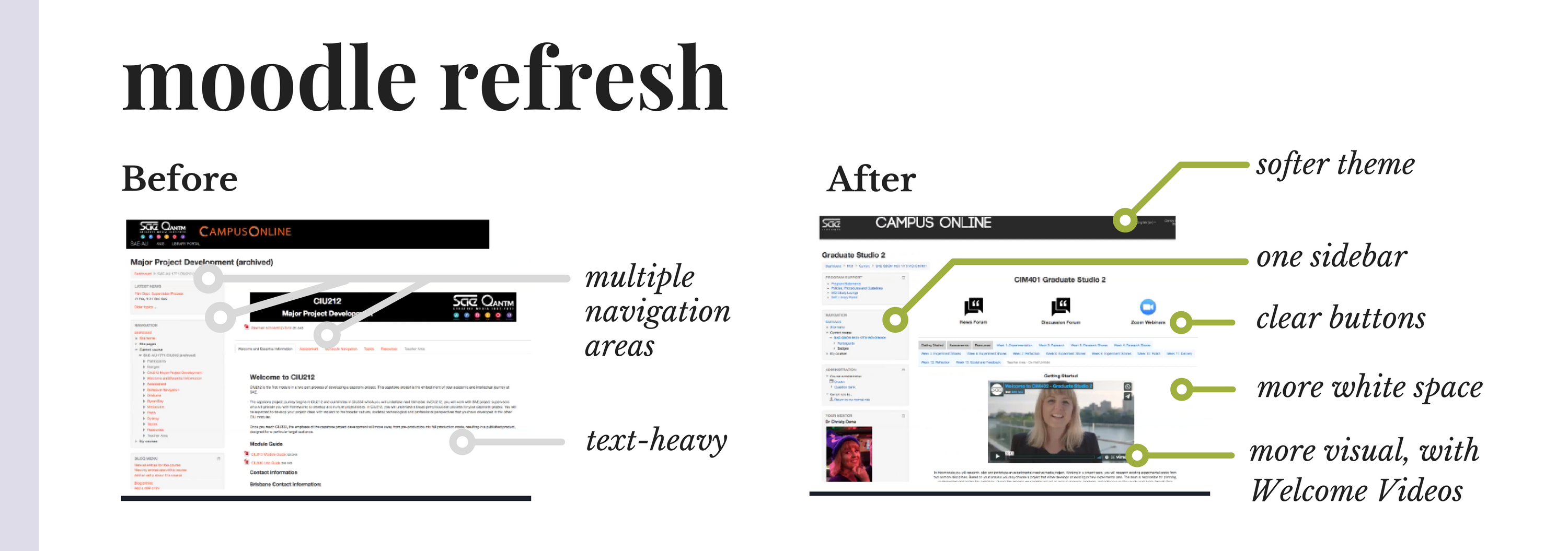
First, with the support of colleagues, my proposal was enacted to really soften the interface in Moodle and create more white space around “centre stage” where learning happens. You can see these key changes in the image below:

Hopefully, you can see the overall improvement! The new interface is designed to be softer on the eye (that is, less cognitive load) to focus one’s eye on the content that we teachers invest so much energy in crafting.
With centre stage now clear, I set about improving my own teaching materials with a view to making them more visual and easier to take in at a glance. Some of those changes were around restructuring the look-and-feel of the overall course, and some have been around creating a sense of flow around each week.
Changes to my overall course
.
Creating a rhythm around each week
.
Looking back on these efforts to reduce unnecessary cognitive load, it’s been a rewarding journey of ongoing improvements. When you push yourself to represent concepts in a more visual way, you are forcing yourself to identify the most important concepts and teach them with clarity. In terms of emotive connection, this mindset has also enhanced the way I build relationships with students. Things like the Welcome Video, profile picture and a weekly Pulse Check all help to give the online classroom a teacher who is present visually and emotionally.
If you would like to hear more about the pedagogy and processes behind these changes, watch the recording of Christy and Ian’s warm and engaging webinar. (David Bowie fans, rejoice: He makes a welcome appearance in all of Ian’s presentations!)
Feeling inspired? Take up the opportunity to reflect on your own teaching practices in the next free professional development course! New rounds are offered regularly via our PD & Events page.
